rachel teresa park
Baby Prep™ Prenatal Sessions - Branding
Client:
Baby Prep™ Prenatal Sessions
Designers:
Rachel Teresa Park and Michael Strasky
Location:
Vancouver, BC
Services Provided:
- Branding/Identity
- Logo Design
- Print Design
- Web Design
- Web Development
Summary:
Kathleen Mochoruk’s Baby Prep has been one of the best prenatal classes in the Greater Vancouver area for the past ten years. Baby Prep was one of the first in the industry and their experience has made them become well-known for being approachable, comfortable, and medically sound. Kathleen’s work as a maternity nurse has given her the most up to date knowledge in the industry. She has positioned her company to be one of few prenatal courses that has has an experienced team of teachers who have seen it all in hospital births to home births.
As time passed, more and more prenatal courses have made their way into the Vancouver market. While Baby Prep still remains on top, there was a need to continue to set the company apart in terms of Baby Prep’s brand and identity. Creating a look that communicates love, comfort, strength, professionalism, medical knowledge, and a fun atmosphere was key.
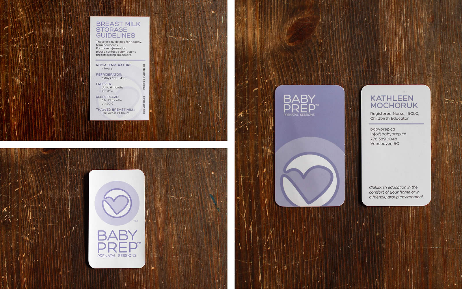
Using purple was a conscious choice, not only is it rarely used in the prenatal class industry but it is the colour used in hospitals for unborn baby’s where the sex hasn’t been discovered. Building a logo that can be interpreted in many ways was also a goal. The logo incorporating a heart, a baby in utero, a pregnant woman is relevant, interesting, and eye-catching and its simplicity and elegance will keep it fresh.
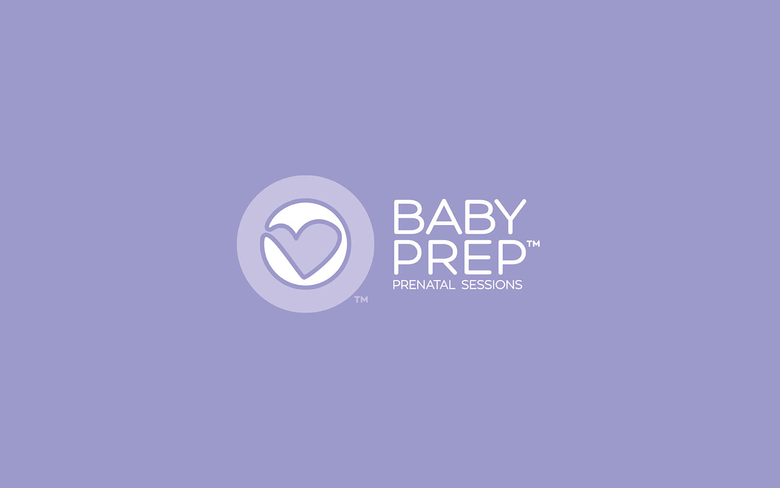

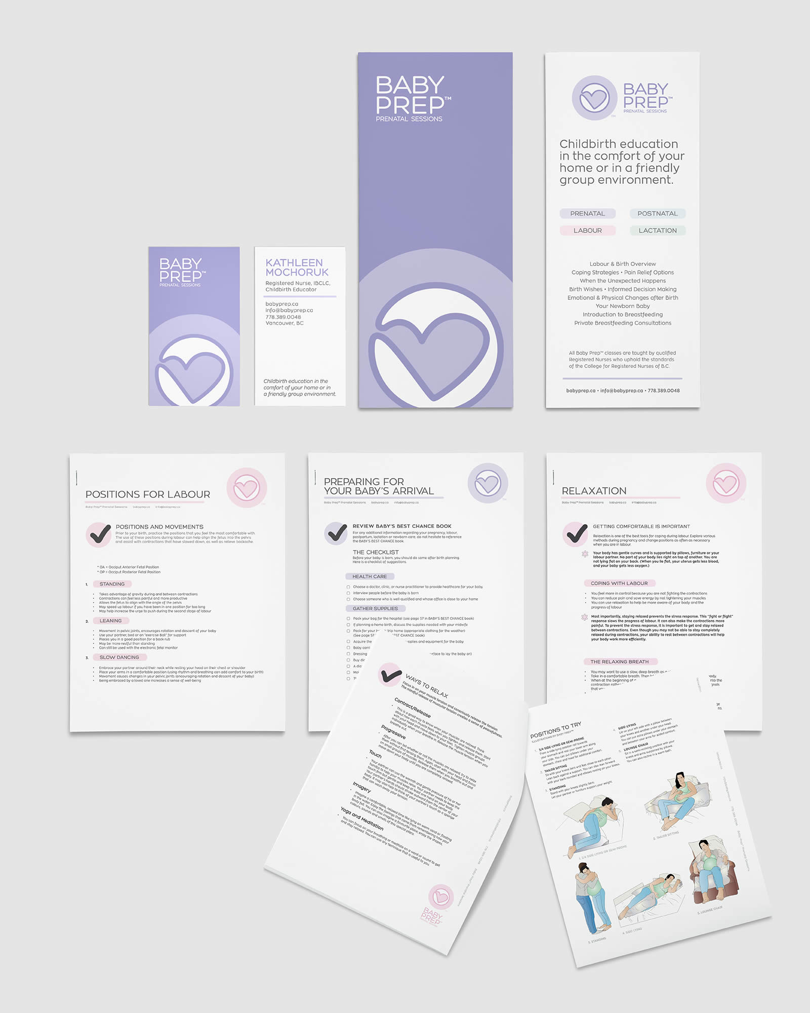
New logo and wordmark design.

Vertical logo variation and secondary colours.
Each colour represents a different time of pregnancy. Purple (primary) is prenatal, pink (secondary) is labour, blue (secondary) is postnatal, and green (secondary) is lactation. Black and white variation for general use when colour is not an option.

Business card and rack card design.

Rack card detail.

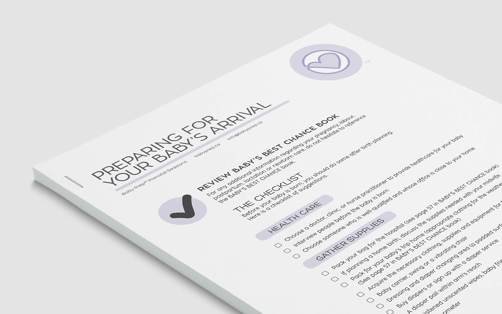
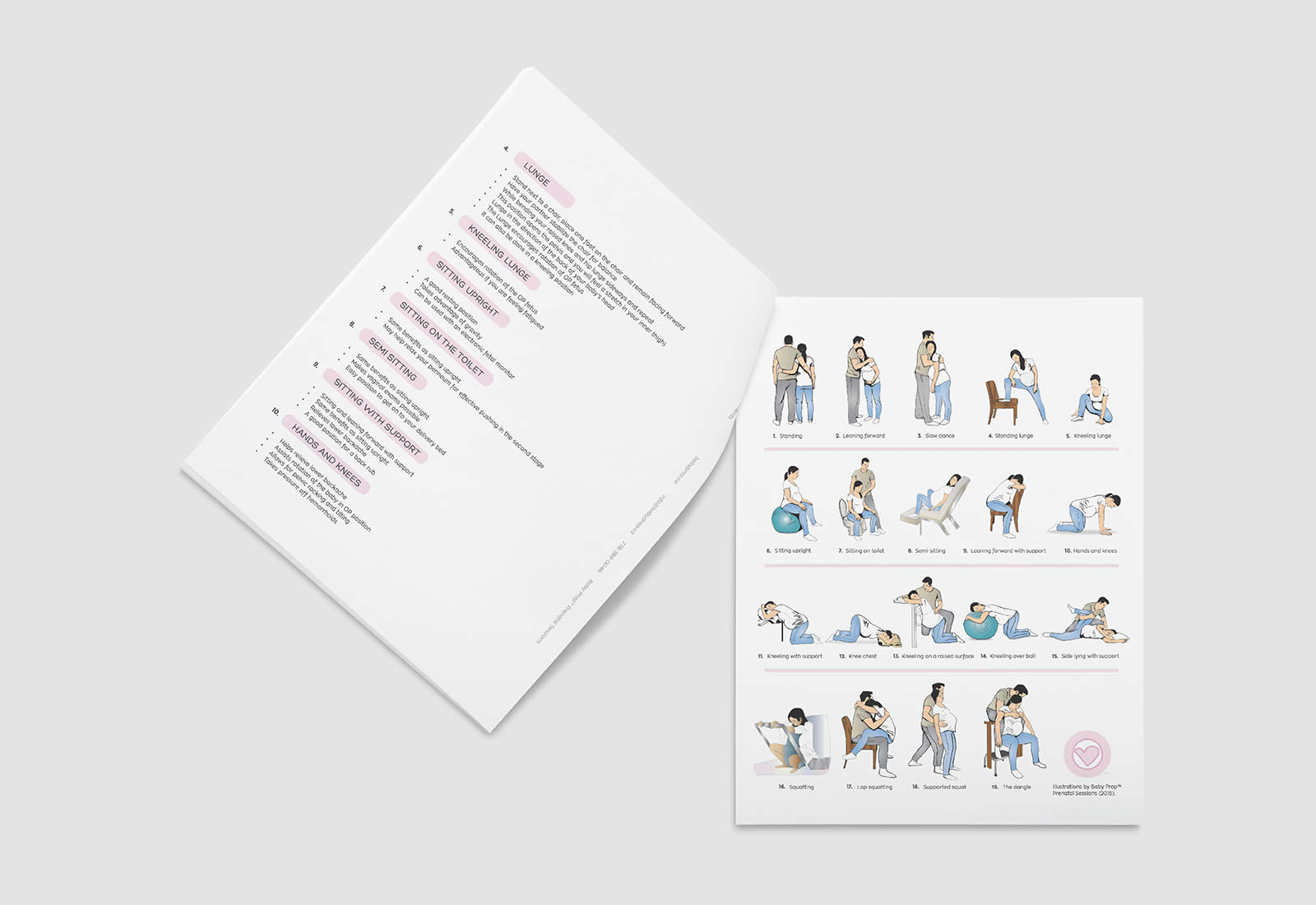
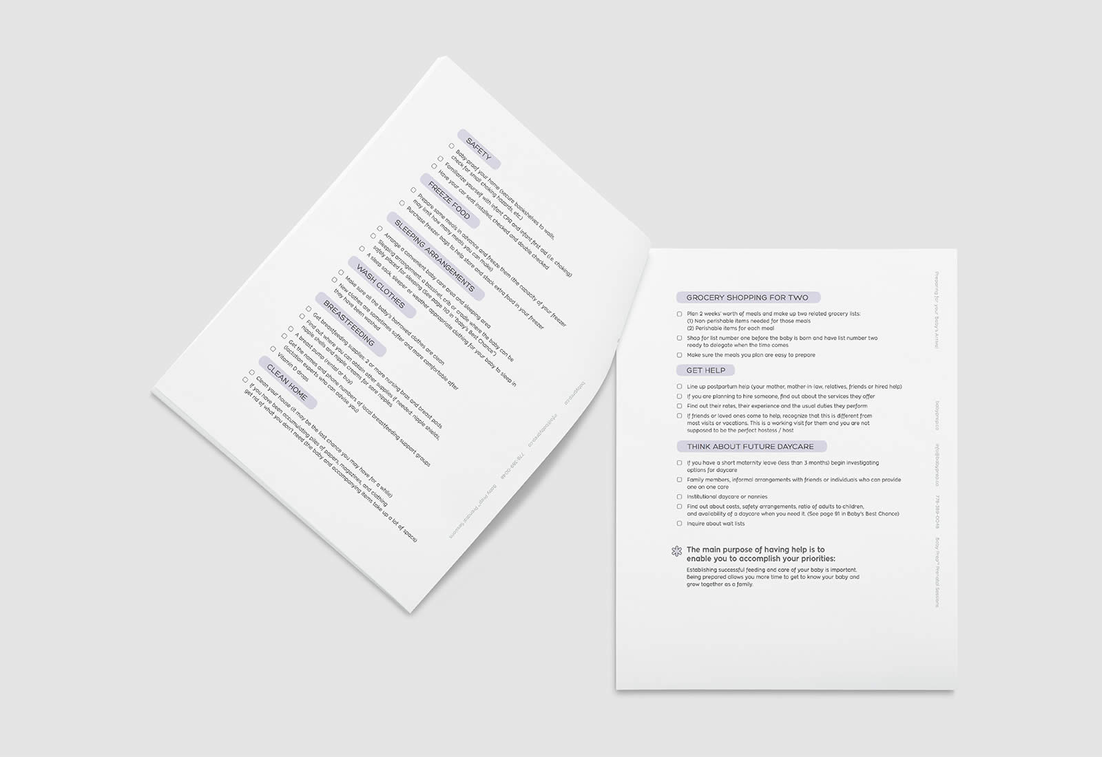
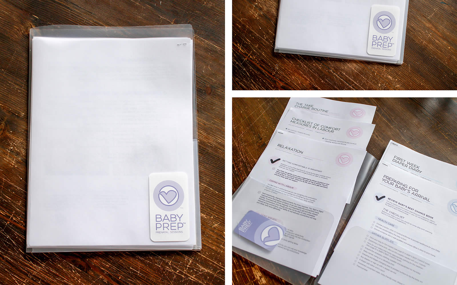
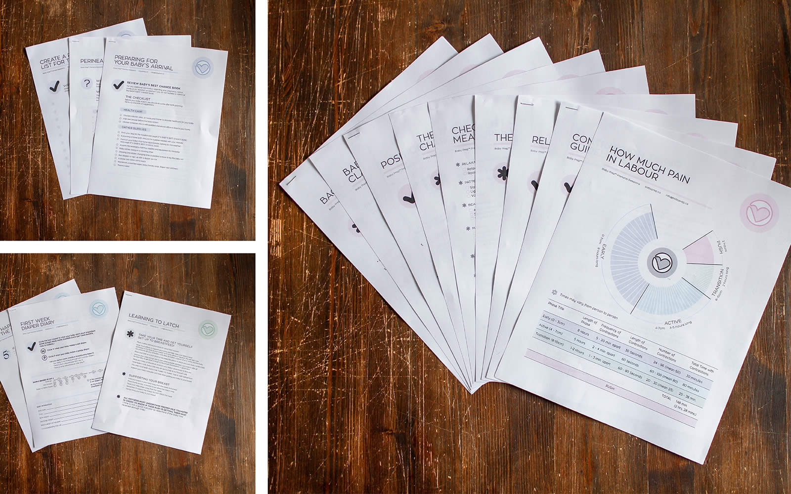
Each area of Baby Prep's™ expertise has a designated colour to be used on various handouts given to the clients.
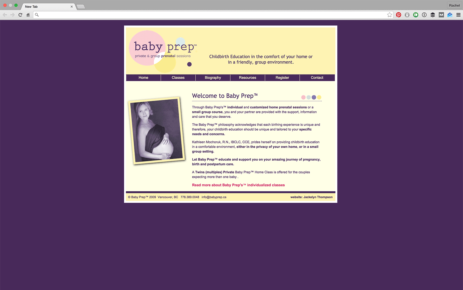
Online

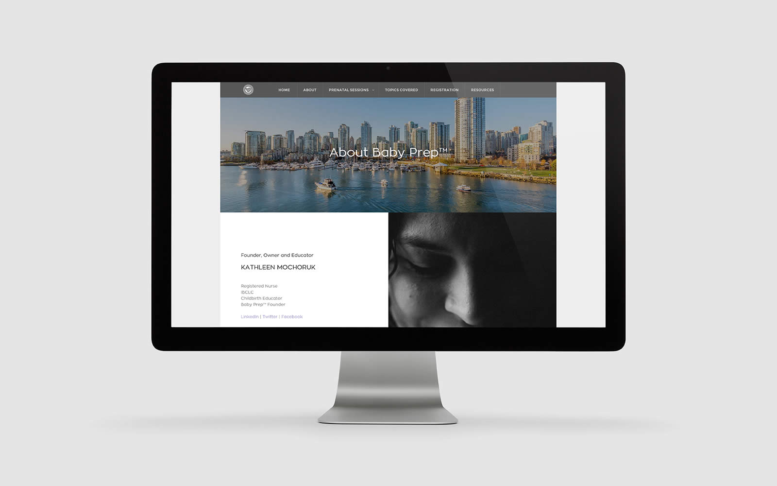
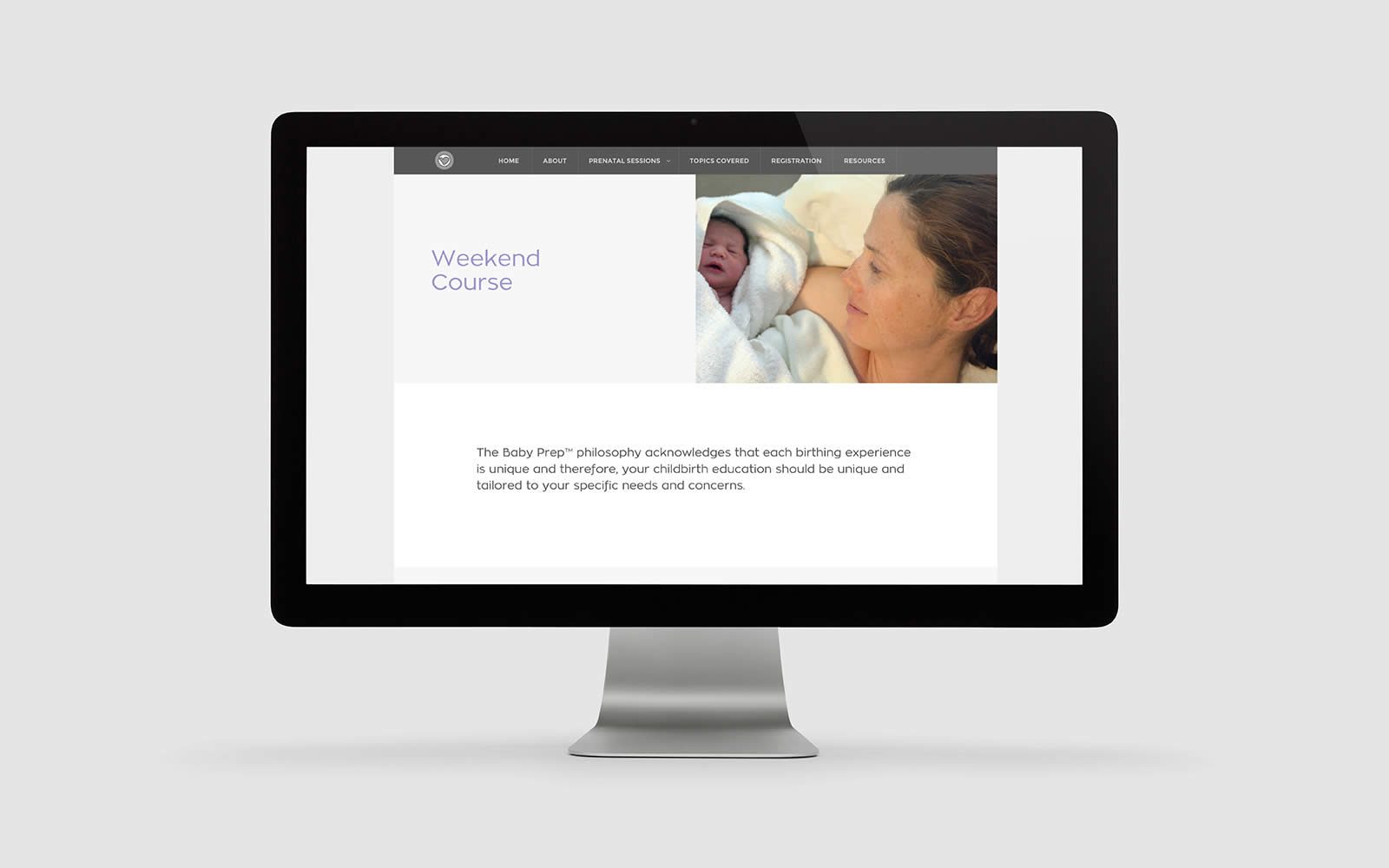
New website design.
Previous Look
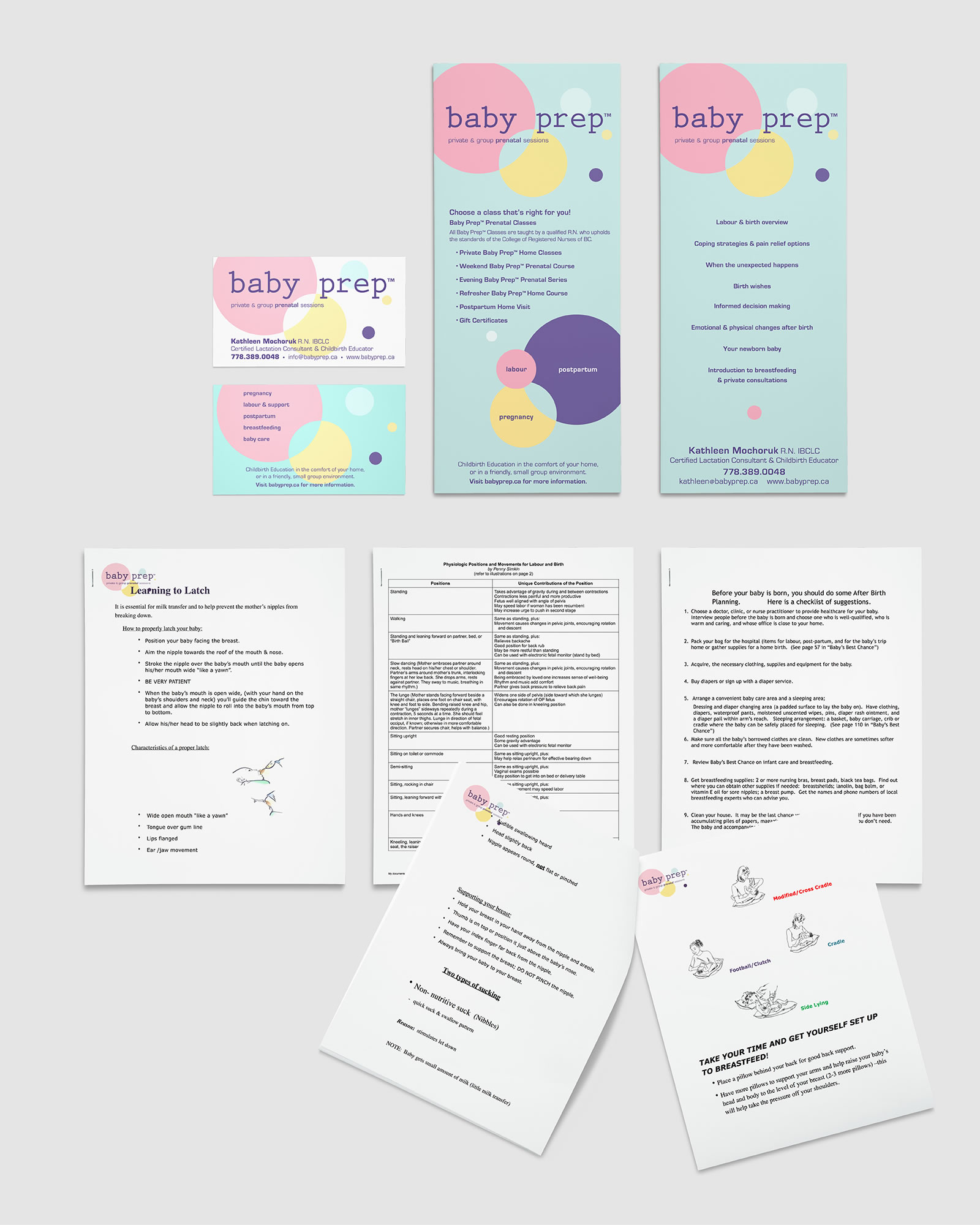
Previous collateral design.
Previous website design.